![]() I am in the midst of generating posters for the Canadian Association of Emergency Physicians (CAEP) conference. My residents and I came across this resourceful site about making them.
I am in the midst of generating posters for the Canadian Association of Emergency Physicians (CAEP) conference. My residents and I came across this resourceful site about making them.
This site is full of tips to make scientific posters cleaner and more informative. I particularly like when he offers suggestions to sample posters.
Tips we learned from the site:
- Colour scheme: choose colours so they are consistent, but not too much gray.
- Font matters: San serif fonts are easier to read, just like in slides. He happens to like Gill Sans, which is my favorite presentation font.
- Text should align.
- White spaces are essential. Try not to crowd the text.
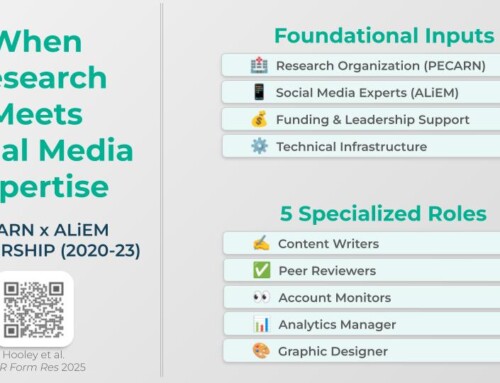
- Some presenters now insert a QR code to embed more content, maybe a video or a website link when the code is scanned by a smartphone.


